Excel Agent Mode changes how dashboards are built—but results still depend heavily on how you prompt it. Unlike traditional Copilot commands, Agent Mode responds best to goal-oriented, structured instructions that describe what you want to achieve, not how to click through Excel.
This article provides 10 proven prompt patterns that consistently produce strong dashboard results using Excel Agent Mode.

How to Think About Prompting in Agent Mode
Before jumping into examples, keep these principles in mind:
- Describe business outcomes, not Excel mechanics
- Specify KPIs and dimensions clearly
- Mention time granularity (monthly, quarterly, yearly)
- Ask for dashboard structure, not just charts
- Expect to refine—Agent Mode is iterative by design
Good prompts lead to dashboards that are usable immediately and easy to improve.
1. Executive KPI Overview Dashboard
Prompt
“Create an executive dashboard showing total revenue, total costs, profit margin, and year-over-year growth. Display KPIs at the top and include monthly trend charts. Organize everything on a single dashboard sheet.”
Why it works
- Clear KPIs
- Clear audience (executives)
- Clear layout expectation
Best for
Leadership reporting, board summaries, monthly reviews
2. Budget vs. Actual Performance Dashboard
Prompt
“Build a budget vs actual dashboard comparing planned and actual values by month and department. Include variance and variance percentage, with charts and a PivotTable for detailed breakdown.”
Why it works
- Explicit comparison logic
- Requests both summary and detail
- Naturally triggers PivotTables and charts
Best for
Finance teams, cost control, planning cycles
3. Sales Performance Dashboard by Region
Prompt
“Create a sales dashboard showing total sales by region and product category. Include a bar chart for regional performance, a line chart for monthly sales trends, and slicers for year and region.”
Why it works
- Specifies dimensions
- Mentions slicers explicitly
- Clear visual expectations
Best for
Commercial teams, regional managers
4. Operational KPI Dashboard
Prompt
“Create an operational dashboard with KPIs for order volume, fulfillment rate, average processing time, and backlog. Add weekly trends and a summary table by operation type.”
Why it works
- Operational metrics are clearly defined
- Time granularity is specified
- Encourages multiple views of the same data
Best for
Operations, supply chain, service teams
5. Financial Trend and Forecast Dashboard
Prompt
“Build a financial trends dashboard showing revenue, expenses, and profit over time. Include monthly trends, rolling averages, and a summary of the last 12 months.”
Why it works
- Clear temporal scope
- Allows Agent Mode to choose appropriate calculations
- Encourages trend-focused visuals
Best for
Finance, FP&A, performance analysis
6. Departmental Performance Comparison Dashboard
Prompt
“Create a dashboard comparing performance across departments using KPIs for output, cost, and efficiency. Include a comparison chart and a PivotTable with department-level details.”
Why it works
- Comparison-driven
- Balanced between summary and detail
- Natural fit for PivotCharts
Best for
Internal benchmarking, performance reviews
7. Marketing Campaign Effectiveness Dashboard
Prompt
“Build a marketing dashboard showing campaign spend, leads generated, conversion rate, and cost per lead. Include charts and allow filtering by campaign and time period.”
Why it works
- Clear metric definitions
- Filterable structure
- Aligns with typical marketing datasets
Best for
Marketing analytics, campaign reviews
8. Project Portfolio Dashboard
Prompt
“Create a project dashboard showing project status, budget usage, completion percentage, and risk level. Include a summary KPI section and a table with project-level details.”
Why it works
- Mixed data types (status, numeric KPIs)
- Encourages structured tables
- Good test of Agent Mode’s planning ability
Best for
PMOs, delivery teams, portfolio oversight
9. HR Metrics Dashboard
Prompt
“Build an HR dashboard showing headcount, hires, attrition rate, and average tenure over time. Include department-level breakdowns and monthly trends.”
Why it works
- Clear HR KPIs
- Time-based insights
- Departmental dimension
Best for
HR analytics, workforce planning
10. Dashboard Skeleton for Rapid Prototyping
Prompt
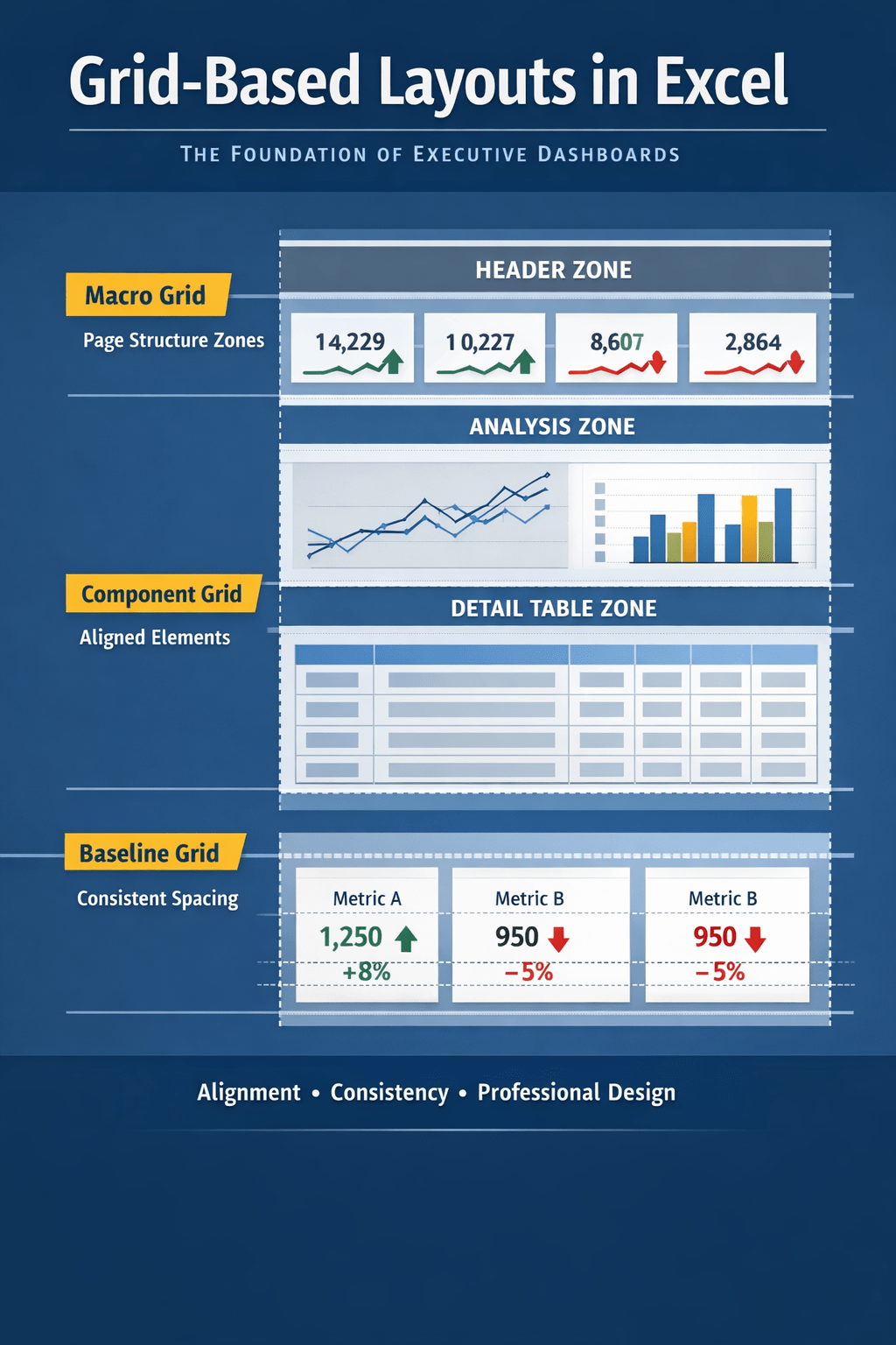
“Create a reusable dashboard template with KPI cards at the top, trend charts in the middle, and a detailed table at the bottom. Use placeholder metrics that can be replaced later.”
Why it works
- Focuses on layout, not data
- Ideal for fast experimentation
- Encourages dashboard reuse
Best for
Prototyping, internal templates, rapid reporting
Best Practices for Refining Agent Mode Dashboards
After the first build, follow up with prompts like:
- “Add slicers for year and department”
- “Separate actual vs forecast”
- “Simplify the layout for executive review”
- “Rename KPIs to be more business-friendly”
Agent Mode performs best when treated as a collaborative builder, not a one-shot generator.
Final Thoughts
Excel Agent Mode is only as powerful as the intent you provide.
The most effective prompts:
- Focus on decisions, not features
- Describe structure and purpose
- Encourage iteration and refinement
Used well, these prompts allow you to move from raw data to a working dashboard in minutes—while keeping Excel fully transparent, editable, and trusted.


