Excel Agent Mode can feel almost magical the first time you use it. You describe what you want in plain language, and Excel starts assembling tables, formulas, charts, and summaries on your behalf.
Yet many users walk away disappointed—not because Agent Mode failed, but because their prompts were fundamentally flawed.
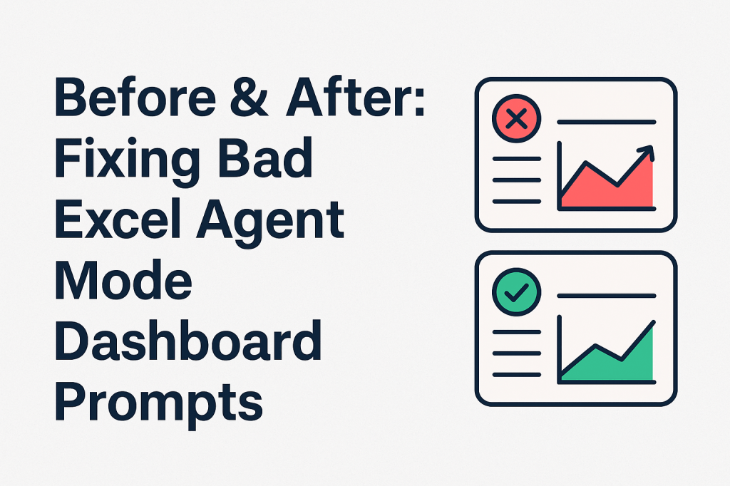
This article takes a practical approach: instead of theory, we’ll look at realistic “bad” dashboard prompts, examine why they fail, and then show rewritten prompts that consistently produce better dashboards.
Think of this as a prompt refactoring guide for Excel Agent Mode.
Why “Before & After” Matters in Agent Mode
Traditional Excel errors are obvious: broken formulas, wrong references, visible mistakes.
Agent Mode errors are more subtle:
- Dashboards look correct
- Numbers are technically valid
- But insights are weak, misleading, or unusable
The difference between a poor dashboard and a great one often comes down to a few extra lines of context in the prompt.
Example 1: The Vague Dashboard Request
❌ Before: Bad Prompt
“Create a sales dashboard.”
What Goes Wrong
Excel Agent Mode has no guidance on:
- Who the dashboard is for
- What time period matters
- Which decisions it should support
The result is usually:
- Generic KPIs
- Random charts
- No clear narrative
✅ After: Fixed Prompt
“Create a monthly sales dashboard for senior management that highlights total revenue, revenue growth vs last month, and the top three regions contributing to growth.”
Why This Works
The agent now understands:
- Audience (senior management)
- Time granularity (monthly)
- Analytical goal (growth drivers)
The output becomes focused and decision-oriented.
Example 2: Asking for Too Much at Once
❌ Before: Bad Prompt
“Build a dashboard with sales, profit, inventory, forecasts, anomalies, and recommendations.”
What Goes Wrong
This prompt forces Agent Mode to:
- Guess priorities
- Compress complex logic
- Produce shallow insights
You often get a crowded dashboard with no hierarchy.
✅ After: Fixed Prompt
“First, build a core dashboard showing monthly sales and profit by product category. After that, we will add inventory and anomaly detection.”
Why This Works
Agent Mode performs better when:
- Tasks are sequenced
- Each step builds on the previous one
You trade speed for accuracy—and win.
Example 3: Ignoring Data Structure
❌ Before: Bad Prompt
“Use this dataset to build KPI cards and charts.”
What Goes Wrong
Agent Mode may:
- Aggregate the wrong fields
- Misinterpret dates
- Treat dimensions as metrics
The dashboard looks fine but tells the wrong story.
✅ After: Fixed Prompt
“Each row represents a single transaction. ‘OrderDate’ is the transaction date, ‘Revenue’ is net sales, and ‘Region’ and ‘Product’ are reporting dimensions. Build KPI cards using this structure.”
Why This Works
You are defining semantic meaning, not just columns. This dramatically improves accuracy.
Example 4: Visual-First Thinking
❌ Before: Bad Prompt
“Create an attractive dashboard with charts and colors.”
What Goes Wrong
Agent Mode optimizes for:
- Visual variety
- Chart quantity
Not insight. The dashboard becomes decorative rather than analytical.
✅ After: Fixed Prompt
“Design the dashboard to clearly show which KPIs are off target before selecting any charts.”
Why This Works
You prioritize:
- Insight
- Interpretation
- Visualization
The charts now serve a purpose.
Example 5: Undefined Comparisons
❌ Before: Bad Prompt
“Show trends and performance changes.”
What Goes Wrong
Trends without reference points are meaningless. Agent Mode must guess:
- Month-over-month?
- Year-over-year?
- Against budget?
Different guesses lead to different conclusions.
✅ After: Fixed Prompt
“Compare current month performance to the previous three-month average and highlight changes greater than 10%.”
Why This Works
You define:
- Baseline
- Threshold
- Interpretation
Now the dashboard highlights what matters.
Example 6: Assuming Business Metrics Are Universal
❌ Before: Bad Prompt
“Calculate churn and customer lifetime value.”
What Goes Wrong
There is no single definition of:
- Churn
- LTV
- Retention
Agent Mode picks a definition—not necessarily yours.
✅ After: Fixed Prompt
“Define churn as customers with no purchases in the last 90 days. Calculate LTV using average monthly revenue multiplied by average retention duration.”
Why This Works
You remove ambiguity from business logic.
Example 7: Skipping Data Validation
❌ Before: Bad Prompt
“Build the dashboard using this data.”
What Goes Wrong
Agent Mode may silently:
- Ignore missing values
- Include duplicates
- Distort averages with outliers
The dashboard looks clean but is untrustworthy.
✅ After: Fixed Prompt
“Before creating the dashboard, identify missing values, duplicate rows, and extreme outliers, and summarize any data quality issues.”
Why This Works
You turn Agent Mode into:
- An analyst
- A data auditor
- A dashboard builder
All in one workflow.
Example 8: Expecting a Final Result Too Early
❌ Before: Bad Prompt
“Generate the final dashboard.”
What Goes Wrong
This discourages:
- Iteration
- Correction
- Improvement
You lock in early assumptions.
✅ After: Fixed Prompt
“Create an initial version of the dashboard, then ask clarifying questions before finalizing.”
Why This Works
Excel Agent Mode performs best as a collaborative partner, not a vending machine.
Key Takeaway: Prompt Refinement Is the New Excel Skill
The difference between bad and great Excel Agent Mode dashboards is rarely technical. It is almost always conceptual.
Bad prompts:
- Are vague
- Prioritize visuals over decisions
- Assume shared understanding
Good prompts:
- Define audience, intent, and benchmarks
- Respect data structure
- Embrace iteration
Final Thought
Excel Agent Mode does not replace dashboard expertise—it exposes it.
When prompts improve, dashboards improve.
When prompts are careless, dashboards fail faster than ever.
If you learn to refactor prompts the same way you once refactored formulas, Agent Mode becomes one of the most powerful analytics tools Excel has ever shipped.