For more than two decades, dashboards have been the operational language of modern organizations. They compress complexity into a shared view: KPIs, trends, exceptions, and comparisons—fast enough for weekly leadership meetings, daily standups, and “what changed since yesterday?” moments.
Then AI-augmented analytics arrived with a bold promise: automated insights, predictions, anomaly detection, and natural-language Q&A. And almost immediately, the hot take followed: “Dashboards are dead.”
They are not. What is changing is not the need for dashboards—but what dashboards do.
AI-augmented analytics does not eliminate dashboards. It upgrades them from static reporting surfaces into adaptive decision systems: dashboards that explain, anticipate, and guide action rather than simply display numbers.
Below is what that reinvention looks like in practice—and how to design dashboards that thrive in an AI-augmented world.
Dashboards Solve a Human Problem AI Does Not Remove
A dashboard is not just a chart collection. It is a coordination mechanism.
It helps groups of people answer three persistent business questions:
- What is the current state? (shared truth)
- What changed? (direction and magnitude)
- What should we do next? (priorities and accountability)
AI can support these questions, but it cannot replace the organizational function of a shared “source of truth” view. Teams still need a consistent place to align on metrics, definitions, and targets. They still need a stable scoreboard that does not morph every time someone asks a new question.
In other words: dashboards are about decision alignment, not just information retrieval. AI makes that alignment faster and more accurate—but it does not make it unnecessary.
Why “Static Dashboards” Feel Like They’re Failing
The “dashboards are dead” argument usually targets a specific kind of dashboard: static, overloaded, and passive.
These dashboards fail in predictable ways:
- Too many charts, too little narrative. Users don’t know where to look first.
- Lagging indicators only. They show what happened, not what’s likely next.
- No explanation layer. When a KPI moves, the dashboard doesn’t tell you why.
- No action layer. It ends at insight; it does not connect to “what to do now.”
- Metric disputes. People lose trust because definitions or data lineage are unclear.
AI-augmented analytics doesn’t kill dashboards; it addresses these failure modes by adding layers dashboards historically lacked: explanation, prioritization, forecasting, and personalization.
What AI-Augmented Analytics Actually Changes
AI-augmented analytics adds capabilities across the analytics workflow:
1) From “Show Me the Numbers” to “Tell Me What Matters”
Instead of requiring users to visually scan every chart, AI can surface:
- top drivers of change (e.g., variance decomposition)
- segments responsible for movement (region, product, channel)
- anomalies and their likely causes
- patterns that indicate emerging issues
The dashboard becomes a prioritized briefing, not a data wall.
2) From Retrospective to Predictive and Prescriptive
Traditional dashboards are excellent at monitoring what already happened. AI brings:
- short-term forecasting (expected next week/month)
- early warning signals (leading indicators)
- scenario simulation (“if conversion drops by 0.5%, what happens to revenue?”)
- prescriptive recommendations (“increase budget in Segment A; ROI is rising”)
The dashboard stops being a rearview mirror and becomes an instrument panel with navigation.
3) From One-Size-Fits-All to Role-Aware Views
Different users need different decisions:
- executives need outcomes and risks
- managers need drivers and levers
- analysts need diagnostics and drill paths
- operators need task queues and alerts
AI can dynamically tailor insight summaries and highlights while keeping metrics consistent. The dashboard becomes role-aware, not fragmented into dozens of competing versions.
4) From Manual Exploration to Conversational Interfaces (With Guardrails)
Natural-language Q&A is powerful for exploration:
- “Why did gross margin drop this week?”
- “Which products drove returns in the North region?”
- “Show me the top accounts at risk of churn.”
But conversational interfaces alone are not sufficient as a primary reporting system because they can produce inconsistent outputs, create audit challenges, and increase ambiguity.
The practical pattern is: conversation sits inside the dashboard, anchored to governed metrics and curated visuals. The dashboard remains the stable frame; AI is the interactive analyst.
The New Dashboard Stack: Four Layers Instead of One
To understand reinvention, it helps to see the dashboard as a multi-layer system:
Layer 1: The Scoreboard (Stable KPIs)
- a small set of core KPIs
- clear definitions and targets
- consistent time windows and filters
- versioned metric logic (governance)
This layer builds trust and alignment.
Layer 2: The Story (What Changed and Why)
- automated variance explanations
- top contributors (segments, products, channels)
- anomaly flags with context (seasonality, campaigns, outages)
This layer reduces interpretation time.
Layer 3: The Outlook (What’s Likely Next)
- forecasts with confidence ranges
- leading indicators
- risk flags (“probability of missing target: 62%”)
This layer supports proactive management.
Layer 4: The Action Layer (What to Do)
- recommended next steps
- assigned owners and workflows (tickets, playbooks)
- alerting thresholds tied to actions
- “decision logs” (what was decided and when)
This layer closes the loop between insight and execution.
AI primarily expands Layers 2–4. Dashboards remain essential for Layer 1—and act as the container that makes the other layers usable and governable.
Why Dashboards Still Matter Even With Great AI
Even if AI were perfect at insight generation, dashboards would remain necessary for five reasons:
1) Governance and Auditability
Organizations need repeatable answers:
- consistent KPI definitions
- traceability to sources
- clarity on refresh times
- explainable transformations
A dashboard—properly designed—functions as a governed interface to business reality.
2) Shared Context Beats Personalized Outputs
AI outputs can be personalized, but decisions are often collective. A shared dashboard view ensures teams are arguing about actions, not about what the numbers are.
3) Visual Pattern Recognition Is Still a Competitive Advantage
Humans spot certain patterns faster visually than through text:
- trend breaks
- seasonality shifts
- distribution changes
- cohort behavior
AI can annotate these patterns, but visuals remain the fastest medium for many analytical tasks.
4) Performance and Reliability
Dashboards can be optimized, cached, and controlled. Pure conversational analytics can be slower, more variable, and more expensive at scale.
5) Safety and Error Containment
AI can be wrong, overconfident, or misled by ambiguous prompts. Dashboards provide guardrails: defined metrics, known filters, and curated charts that reduce misinterpretation risk.
What “Reinvented Dashboards” Look Like: Practical Examples
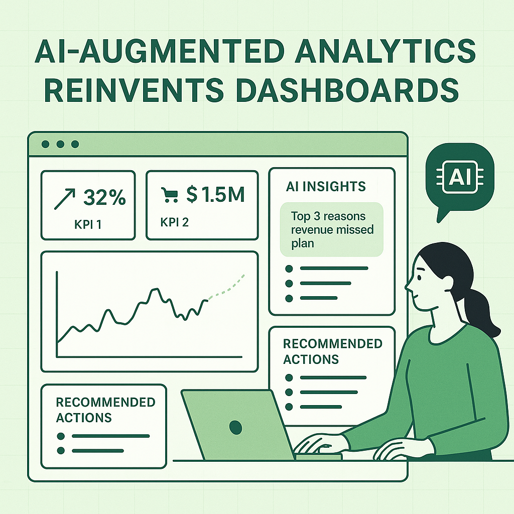
Example A: Sales Performance Dashboard (Traditional vs Reinvented)
Traditional:
- Revenue, pipeline, win rate charts
- filter by region/product
- user must hunt for causes
Reinvented with AI:
- KPI cards + target variance
- “Top 3 reasons revenue missed plan” (drivers)
- “Accounts most likely to slip this quarter” (risk forecast)
- “Recommended actions” (follow-ups, pricing review, pipeline hygiene)
- conversational box: “Ask why” anchored to governed metrics
Example B: Inventory Dashboard
Traditional:
- stock levels, turnover, aging inventory
- users manually check exceptions
Reinvented:
- anomaly detection on demand spikes
- predicted stock-outs by SKU/store
- supplier delay impact simulation
- reorder recommendations with confidence levels
- alert thresholds linked to workflow tasks
The core visuals remain. AI adds prioritization, prediction, and operational closure.
Design Principles for Dashboards in the AI Age
If you are building dashboards now—especially in Excel, Power BI, or hybrid environments—these principles will keep them relevant.
1) Keep the Scoreboard Small and Sacred
Limit “top KPIs” to what the organization truly runs on. AI can generate many insights; the dashboard must remain anchored.
2) Make Explanations First-Class
Don’t hide “why” in drill-downs. Add:
- variance breakdowns
- driver tables
- contributing segments
- narrative summaries
3) Use AI as a Copilot, Not the Pilot
Let AI propose, summarize, and flag—while users confirm and decide. This improves trust and reduces the “black box” effect.
4) Always Show Confidence and Assumptions
For any forecast, anomaly, or recommendation:
- show confidence bands or probabilities
- list the main drivers used
- clarify the time horizon
- indicate whether seasonality was considered
5) Close the Loop With Actions
Dashboards should produce outcomes:
- alerts that map to playbooks
- recommended actions with owners
- tracked follow-ups and resolution notes
A dashboard without an action layer is a report, not a decision system.
6) Design for Questions, Not Just Views
Assume users will ask:
- “Why did it change?”
- “What’s driving it?”
- “What happens next?”
- “What should I do?”
Build the UI and metric model so those questions can be answered quickly—either through curated drill paths or embedded conversational analytics.
The Biggest Risk: AI Without Dashboard Discipline
The real threat is not AI replacing dashboards. It is AI being layered onto weak analytics foundations.
If your metrics are inconsistent, your data model is unclear, and your dashboard is cluttered, AI will amplify confusion—because it will generate explanations for numbers people do not trust.
The reinvention works best when:
- KPI definitions are governed
- dimensional models are clean
- refresh cycles are understood
- users share a consistent “truth layer”
AI augments strong analytics. It does not compensate for a lack of it.
The Bottom Line
Dashboards are not disappearing. They are evolving from passive displays into intelligent decision environments.
AI-augmented analytics reinvents dashboards by adding:
- automated explanations
- anomaly detection and prioritization
- forecasting and scenario modeling
- role-aware narratives
- action workflows and closed-loop execution
The dashboard remains the trusted stage. AI becomes the embedded analyst.
Organizations that succeed will not choose between dashboards and AI. They will combine them—using dashboards for stability and governance, and AI for speed, clarity, and better decisions.