Excel’s new Agent Mode represents a major step forward in AI-assisted analytics. With a well-crafted prompt, it can summarize data, generate charts, propose KPIs, and even suggest narratives—all in minutes.
However, Agent Mode is not universally appropriate.
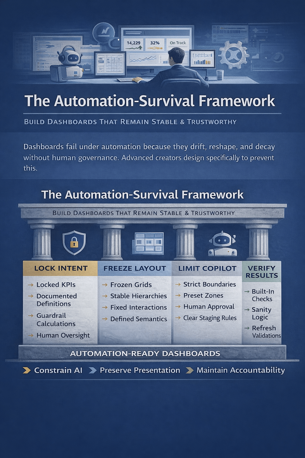
In fact, many dashboard failures in 2025 are not caused by poor data—but by using Agent Mode in situations where it should not be used at all. Understanding these boundaries is critical if you want dashboards that are reliable, explainable, and trusted by stakeholders.
This article outlines when Agent Mode is the wrong tool for dashboard creation, and what to use instead.

1. When the Dashboard Must Be 100% Deterministic
Agent Mode is probabilistic by design. It interprets intent, infers structure, and makes judgment calls.
That is a problem when dashboards must be:
- Financially auditable
- Regulatory-compliant
- Reproducible down to the cell
- Used for statutory or board-level reporting
Examples include:
- Financial close dashboards
- SOX-controlled KPI reporting
- Regulatory submissions
- Budget vs. actuals used for compensation
In these scenarios, manual formulas, controlled pivot tables, and locked models are mandatory. Even small AI-introduced variations—such as inferred aggregations or renamed metrics—can undermine trust.
Rule of thumb:
If you must explain exactly how a number was calculated, do not let an agent invent the logic.
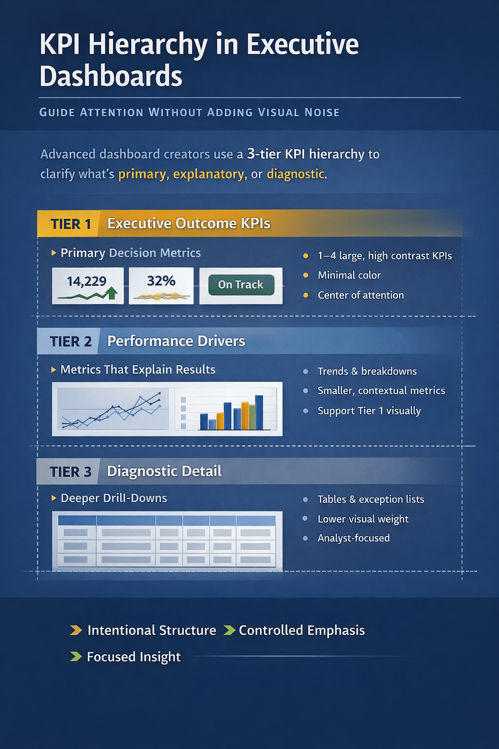
2. When KPI Definitions Are Politically or Strategically Sensitive
Dashboards are not neutral artifacts. KPIs often encode organizational power.
Agent Mode may:
- Redefine metrics using “industry standards”
- Aggregate data in ways that shift accountability
- Surface comparisons stakeholders did not approve
This is dangerous when:
- KPIs are negotiated between departments
- Metrics are contractually defined
- Leadership alignment is fragile
For example, “Customer Churn” might be defined differently by Finance, Sales, and Product. An agent that “simplifies” this metric can unintentionally rewrite strategy.
Best practice:
Define KPIs explicitly, document formulas, then use Agent Mode only for visualization—not metric design.
3. When the Dataset Is Messy, Incomplete, or Context-Heavy
Agent Mode performs best on clean, well-labeled, rectangular data.
It performs poorly when:
- Columns are inconsistently named
- Data mixes operational and analytical fields
- Business logic lives in human context, not cells
- Edge cases dominate outcomes
In these cases, the agent may:
- Guess column meanings
- Drop rows silently
- Misinterpret categorical values
- Smooth over missing data
This leads to dashboards that look professional but are fundamentally wrong.
Recommendation:
Clean, model, and validate the dataset manually first. Agent Mode should be the last step—not the first.
4. When Users Need to Learn Excel (Not Avoid It)
Agent Mode accelerates output—but it also hides mechanics.
If your goal is to:
- Train analysts
- Upskill business users
- Teach dashboard best practices
- Build internal Excel literacy
Then relying on Agent Mode is counterproductive.
Users who skip:
- Pivot logic
- Formula dependencies
- Data modeling concepts
End up unable to:
- Debug dashboards
- Modify logic safely
- Maintain reports long-term
Agent Mode is a productivity layer—not a learning tool.
For training environments, start with manual builds and introduce Agent Mode only after fundamentals are mastered.
5. When Dashboards Must Be Maintained for Years
AI-generated dashboards often lack:
- Structural consistency
- Clear documentation
- Stable naming conventions
This becomes a serious problem when:
- Dashboards are handed over to new owners
- Teams change
- Data sources evolve
- Reporting logic must be extended
A human-built dashboard reflects intentional design. An agent-built dashboard reflects current intent, not future needs.
Long-lived dashboards demand explicit architecture.
6. When Performance and Scale Matter
Agent Mode may generate:
- Volatile array formulas
- Inefficient aggregations
- Redundant calculations
On large datasets, this can result in:
- Slow recalculation
- File instability
- High memory usage
For enterprise-scale Excel dashboards:
- Manual optimization
- Power Pivot / Data Model
- Pre-aggregated tables
are still superior.
Agent Mode optimizes for speed of creation, not runtime performance.
7. When Visual Consistency Is Non-Negotiable
Organizations with:
- Brand-aligned dashboards
- Standardized executive reporting
- Design systems for analytics
Will find Agent Mode frustrating.
Agents tend to:
- Mix chart types
- Use default color palettes
- Change layouts between runs
If visual consistency equals credibility in your organization, manual layout control is essential.
A Practical Decision Framework
Before using Agent Mode, ask:
- Is this dashboard auditable?
- Are KPI definitions fixed and approved?
- Is the data clean and well-modeled?
- Will someone else maintain this later?
- Does performance matter at scale?
- Is design consistency required?
If you answer “yes” to more than two of these, Agent Mode should be used cautiously—or not at all.
Final Thought: Agent Mode Is a Power Tool, Not a Default
Agent Mode is excellent for:
- Exploratory dashboards
- Rapid prototypes
- Executive previews
- Insight discovery
It is not a replacement for:
- Data modeling
- Governance
- Analytical rigor
The most effective Excel professionals in 2026 will not ask “Can the agent build this?”
They will ask “Should the agent build this?”
That distinction separates automation from expertise.