Dashboards used to be the “single source of truth” for performance: they pulled historical data into charts, KPIs, and pivots so people could monitor what already happened. AI-augmented analytics changes that contract.
Instead of dashboards acting purely as display layers, AI adds an analysis layer that can interpret data, surface signals, explain drivers, and propose actions—often in natural language. The dashboard becomes less of a destination (“go look at the report”) and more of an interface for decision-making (“ask what’s changing, why, and what to do next”).
This article explains what AI-augmented analytics is, what it is not, how it works in practice (especially in Excel-centric workflows), and how the role of dashboards changes for analysts, managers, and dashboard builders.
AI-Augmented Analytics: A Practical Definition
AI-augmented analytics is the use of machine learning and generative AI to enhance the analytics workflow across the full lifecycle:
- Data preparation: detecting data quality issues, suggesting joins, automating transformations
- Analysis: identifying patterns, anomalies, segments, and relationships automatically
- Explanation: generating narratives about changes (drivers, contributions, correlations, likely causes)
- Prediction: forecasting future outcomes and confidence bands
- Recommendation: proposing actions, next analyses, or decision options
- Interaction: enabling natural-language queries and guided exploration
The key word is augmented. AI does not replace measurement; it extends it. The dashboard still needs reliable metrics and governance. What changes is how quickly you can go from measurement to understanding to action.
What AI-Augmented Analytics Is Not
There’s a lot of marketing noise. Here are common misconceptions:
- Not just “a chatbot on top of a dashboard.”
A chat UI without strong data modeling, metric definitions, and guardrails becomes a confident guesser. Real AI augmentation depends on trustworthy data, consistent semantic definitions, and auditable outputs. - Not the same as “auto-insights” alone.
Auto-insights (like “sales up 8%”) are useful, but augmentation goes further—driver decomposition, scenario testing, predictive alerts, and decision support. - Not a replacement for business logic.
If your organization defines “Active Customer” or “Gross Margin” in a specific way, AI must be constrained to those definitions. Otherwise, you’ll get plausible-but-wrong answers. - Not magic: it needs context.
The best outputs come from clear metadata: metric definitions, hierarchies, time grains, and relationships (customer → region → product → channel).
Why Dashboards Are Changing Now
Traditional dashboards excel at three things:
- Standardized reporting
- Monitoring known KPIs
- Comparing periods and segments
But they struggle with:
- Explaining why a KPI changed
- Surfacing what changed that you didn’t think to look for
- Predicting what happens next
- Answering ad hoc questions quickly and consistently
AI helps because it can:
- Scan many dimensions without manual pivoting
- Detect anomalies and shifts early
- Summarize insights in plain language
- Generate “next best questions” and recommended slices
- Forecast and quantify uncertainty
So the dashboard’s role shifts from reporting to decision intelligence.
How AI-Augmented Analytics Works Under the Hood
You don’t need to memorize the tech, but it helps to understand the moving parts:
1) A Semantic Layer: “What do metrics mean?”
A semantic layer defines:
- Metrics (Revenue, CAC, Churn)
- Filters (Active, Region)
- Time grains (daily, weekly, monthly)
- Relationships and hierarchies
Without this, AI can misinterpret metrics or blend incompatible time grains.
2) Statistical/ML Layer: “What’s unusual, what predicts what?”
Common capabilities:
- Anomaly detection (spikes/drops)
- Forecasting (ARIMA/ETS/Prophet-like patterns, ML regressors)
- Classification (risk flags, churn likelihood)
- Clustering (segments)
- Contribution/driver analysis (variance decomposition)
3) Generative Layer: “How do we explain it and interact with it?”
Generative AI (LLMs) contributes:
- Narrative summaries (“What changed and why”)
- Natural language query (“Show revenue drop drivers in EMEA last month”)
- Automated commentary for stakeholder updates
- Suggested next analyses (“Check channel mix shift; validate pricing changes”)
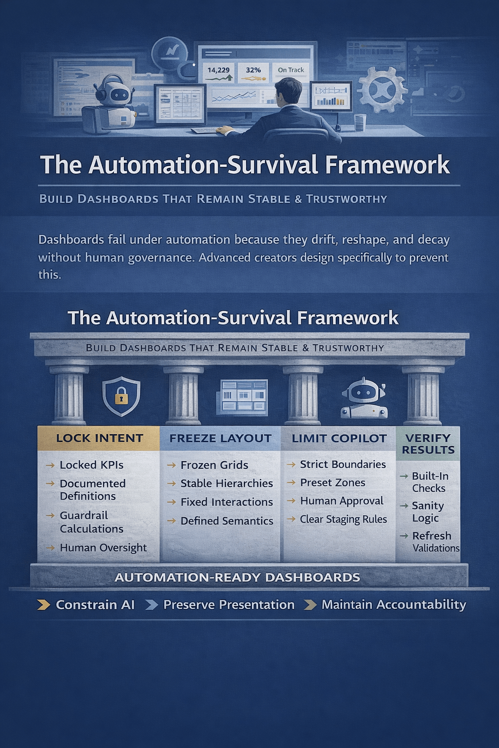
4) Guardrails and Governance: “How do we keep it safe and consistent?”
This includes:
- Role-based access (who can see what)
- Metric definitions as the source of truth
- Limits on hallucinations (cite data references, show calculations)
- Validation checks and confidence scores
- Logging and auditability
The New Role of Dashboards: From “Scoreboards” to “Decision Interfaces”
A helpful way to think about it is this evolution:
Old dashboard
- You open a report.
- You interpret charts.
- You decide what to check next.
- You build new pivots or ask an analyst.
AI-augmented dashboard
- The system highlights what changed.
- It proposes likely drivers with supporting breakdowns.
- You ask follow-ups in plain language.
- It generates scenarios and recommended actions.
- It produces a narrative summary you can share.
This turns dashboards into interactive analytic workbenches—not just visualization walls.
What Changes for Key Roles
For analysts (and “Excel power users”)
Less time spent on:
- Repeating the same pivots
- Writing routine commentary
- Manually slicing every dimension to find the driver
More time spent on:
- Defining metrics and logic (semantic layer)
- Designing guardrails and validations
- Making insights decision-ready (context, assumptions, impact)
In short: analysts shift from report builders to decision enablers and model stewards.
For managers and operators
Less dependency on “Can someone pull this cut?”
More self-service via guided questions and AI summaries.
But the manager’s responsibility increases: they must understand confidence, assumptions, and what evidence supports an insight.
For dashboard builders
The craft shifts from:
- “Perfect layout and slicers”
to - “Perfect metric definitions, drill paths, and insight workflows”
The best AI-augmented dashboards are designed around questions and actions, not just charts.
What AI Adds That Traditional Dashboards Don’t Do Well
1) Driver decomposition at scale
Instead of just “Actual vs Budget,” AI can propose:
- The top contributors to variance by product, region, customer segment
- Whether it’s mix, volume, or price
- Whether it’s localized or systemic
2) Predictive layers
Dashboards stop being purely descriptive:
- Forecast KPI trajectory
- Compare forecast vs target
- Flag risk early (“You’re likely to miss target by 6–9%”)
3) Anomaly alerts and narrative explanations
Rather than “someone noticed,” the system pushes:
- “Conversion rate dropped unusually in mobile Safari in NL since Tuesday”
- With drilldowns and likely causes to investigate
4) Natural-language query and guided exploration
Users can ask:
- “Why did margin drop last month?”
- “Which products caused it?”
- “Is this seasonal or new?”
- “What’s the impact if we restore last month’s pricing?”
The value is not just the answer, but the speed of iteration.
How This Looks in an Excel-Centered Workflow
Even if your organization lives in Excel, AI augmentation is still real—because the bottleneck has never been charting. The bottleneck is analysis time and explanation quality.
Here are practical patterns for Excel mini-dashboards:
Pattern A: “Explain this KPI” panel
You keep your KPI cards as usual, but add:
- “What changed?” (top drivers)
- “Why likely?” (evidence-based hypotheses)
- “What to check next?” (suggested slices)
- “Confidence” indicator and data references
Pattern B: Variance narrative generation
For monthly reporting:
- Auto-generate a first draft of commentary
- Include numeric contributions and ranked drivers
- Analyst reviews/edits and approves
Pattern C: Predictive KPI card
Next to “Actual,” add:
- Forecast end-of-month
- Probability of hitting target
- Primary risk factor
Pattern D: Automated segmentation
Instead of manually building cohorts:
- AI clusters customers or products into behavioral groups
- You monitor segment trends as dashboard views
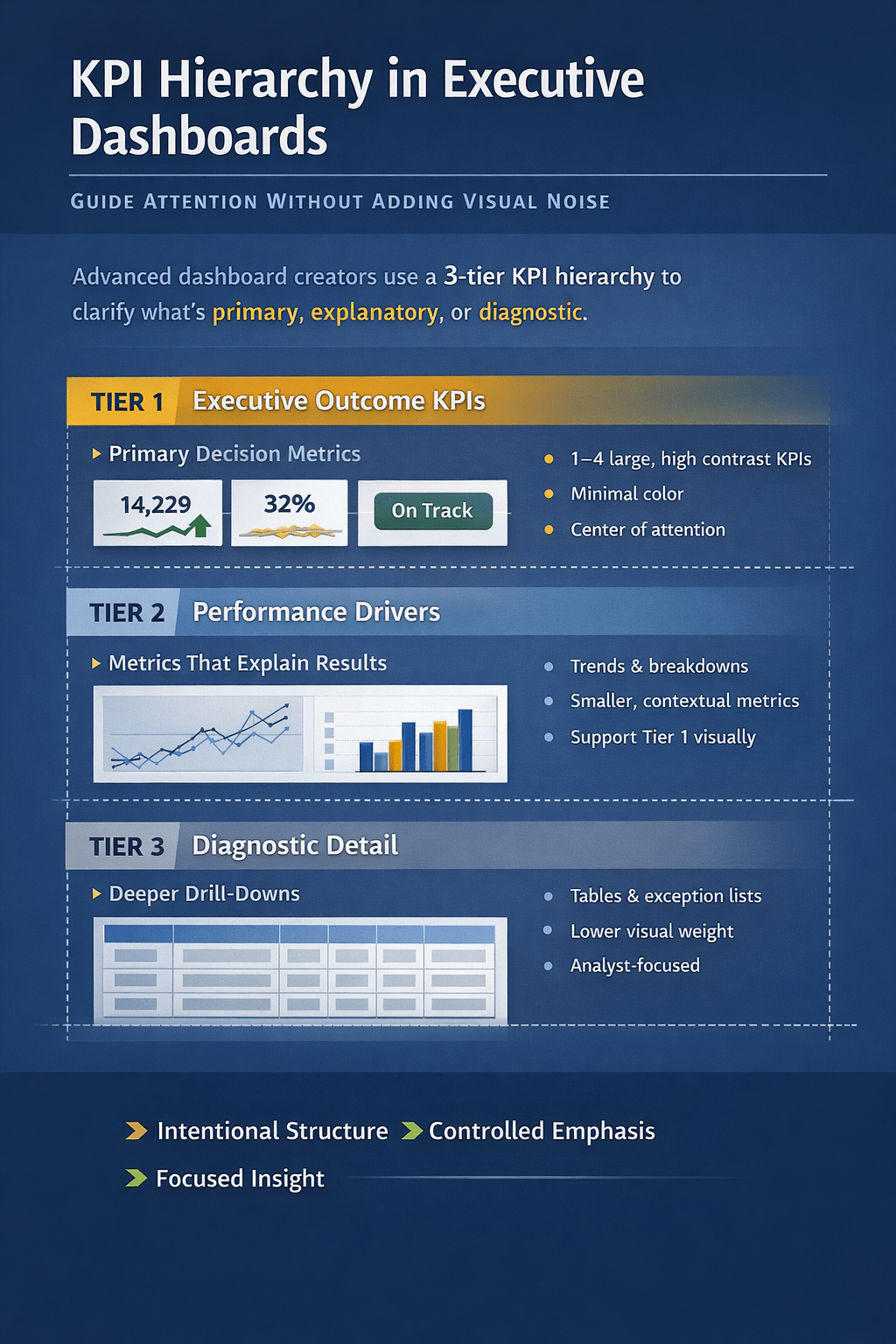
New Dashboard Design Principles in the AI Era
If you’re building dashboards for an AI-augmented workflow, optimize for these:
- Question-first layout
Organize around the top stakeholder questions:- What changed?
- Why?
- What happens next?
- What should we do?
- Explainability baked in
Every AI insight should link to:- The data slice used
- The calculation method
- The comparison baseline
- A confidence level or uncertainty range
- Guided drill paths
Don’t rely on unlimited slicers. Provide:- “Top drivers” buttons
- “Show anomalies” view
- “Compare vs forecast/target” toggles
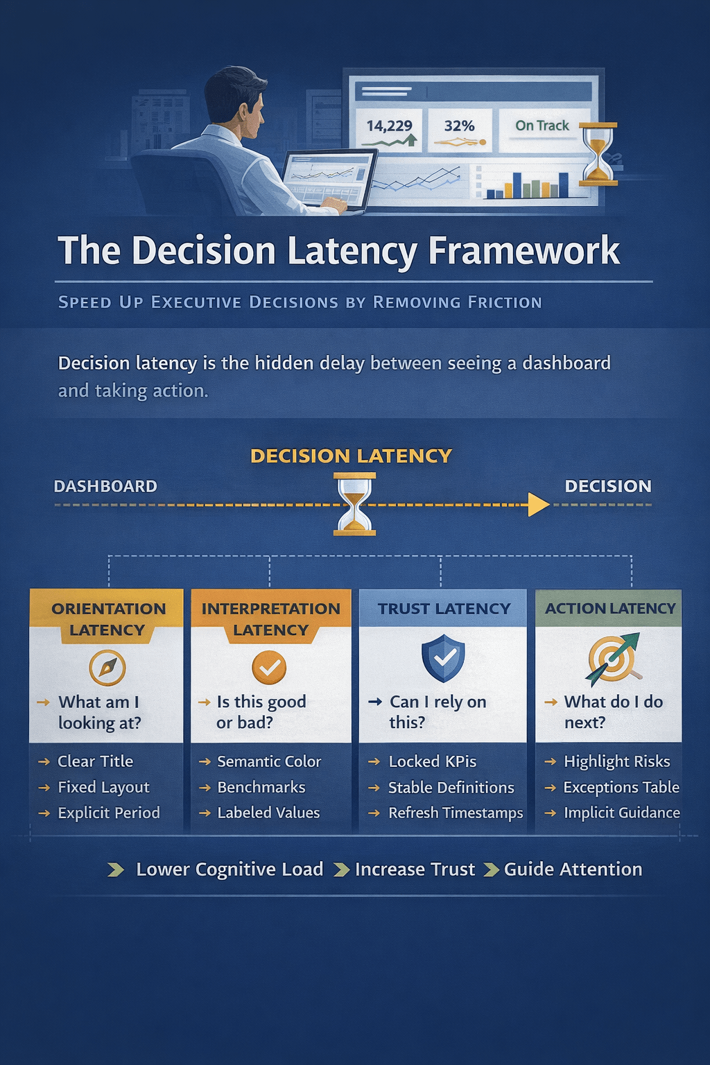
- Trust mechanisms
Users trust what they can verify quickly:- Show supporting tables
- Provide reconciliation totals
- Include data freshness and coverage stats
- Human-in-the-loop
For important reporting, AI drafts; humans approve.
Make the review workflow explicit.
Risks and How to Manage Them
AI augmentation is powerful, but it introduces new failure modes:
Hallucinated explanations
Mitigation:
- Require that narratives cite numeric evidence
- Restrict AI to defined metrics and approved datasets
- Add “show work” links (tables, pivot outputs, filters)
Metric drift and definition chaos
Mitigation:
- Centralize definitions
- Enforce a semantic layer
- Version metrics and document changes
Over-automation of decisions
Mitigation:
- Recommendations should be presented as options with tradeoffs
- Separate “insight” from “action approval”
- Track outcomes (did the recommended action help?)
Privacy and access leakage
Mitigation:
- Strong role-based controls
- Redaction rules for sensitive fields
- Audit logs for queries and outputs
What To Expect Over the Next 12–24 Months
For most organizations, the path looks like:
- AI-assisted commentary (fast win)
- Automated driver analysis (variance + anomaly detection)
- Predictive KPI layers (forecast + risk)
- Conversational analytics (NLQ with guardrails)
- Prescriptive workflows (recommendations integrated with ops)
Dashboards won’t “end.” But the center of gravity moves:
- from static visualization
- to interactive analysis and decision support
Conclusion: Dashboards Become Interfaces for Thinking
AI-augmented analytics changes dashboards from screens that show metrics into systems that help people reason about metrics.
If you build Excel mini dashboards, the opportunity is straightforward:
- Keep the clarity of KPIs and visuals
- Add AI layers that accelerate explanation, prediction, and action
- Build trust through transparency and validation
The organizations that win won’t be the ones with the prettiest charts. They’ll be the ones whose dashboards reduce decision time while increasing decision quality.