For decades, dashboards have been the backbone of business reporting. They summarize performance, visualize trends, and help teams answer one fundamental question: What happened?
Today, that question is no longer enough. As data volumes grow and decision cycles accelerate, organizations are moving beyond static dashboards toward AI-augmented analytics—a shift that is transforming reporting from descriptive to predictive.
This evolution does not signal the end of dashboards. Instead, it marks their next phase.
The Era of Static Dashboards: Clear, Reliable, but Limited
Traditional dashboards—especially those built in Excel—excel at structure and clarity. They aggregate data into KPIs, charts, and tables that are easy to interpret and share.
Their strengths are well known:
- Consistent, repeatable reporting
- Full transparency of calculations
- Strong human interpretability
- Low technical barriers for business users
However, static dashboards are fundamentally reactive. They tell you what has already occurred, but they rely on the user to:
- Spot anomalies
- Identify trends
- Interpret root causes
- Decide on next actions
As datasets become larger and more complex, this manual interpretation becomes a bottleneck.
What AI-Augmented Analytics Adds to Reporting
AI-augmented analytics introduces machine learning and statistical models on top of traditional reporting. Instead of replacing dashboards, AI enhances them with automated reasoning.
Key capabilities include:
- Pattern detection across large datasets
- Anomaly identification without predefined thresholds
- Forecasting future values and trends
- Narrative explanations generated from data
- Recommendations based on historical behavior
In practice, AI answers new questions:
- Why did this KPI change?
- What is likely to happen next?
- Which metric deserves attention right now?
This is where reporting becomes predictive rather than purely descriptive.
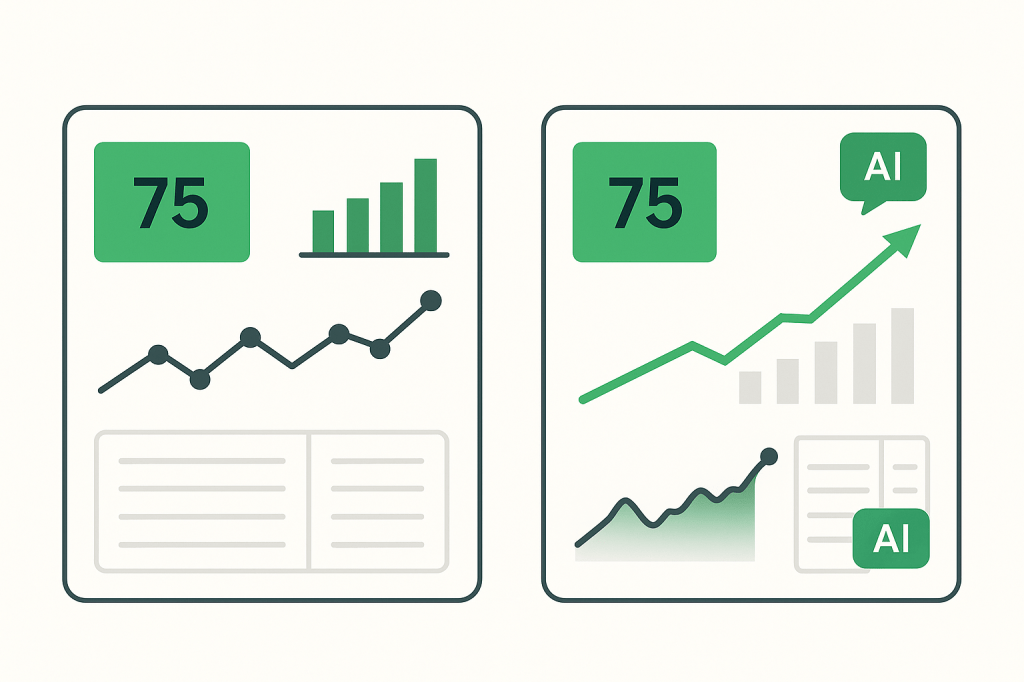
Dashboards Are Not Replaced—They Become the Interface
A common misconception is that AI makes dashboards obsolete. In reality, dashboards become the delivery layer for AI insights.
Think of the new relationship like this:
- Dashboards remain the visual, trusted interface
- AI models operate in the background, analyzing continuously
- Insights are surfaced contextually within existing charts and KPIs
Examples include:
- A variance KPI that explains why it moved
- A trend chart that highlights likely future breakpoints
- A table that flags unusual values automatically
The dashboard stays familiar—but becomes significantly more intelligent.
Why Excel Still Matters in AI-Augmented Analytics
Despite the rise of advanced BI platforms, Excel remains deeply relevant in this transition.
Reasons include:
- Massive installed user base
- Flexibility for rapid experimentation
- Compatibility with Python, Power BI, and AI services
- Strong role in financial, operational, and ad-hoc analysis
Modern Excel dashboards can already act as AI-ready containers, consuming:
- Forecast outputs
- AI-generated explanations
- Automated alerts
- Scenario simulations
For many teams, Excel is the most practical bridge between traditional dashboards and AI-augmented analytics.
From “What Happened” to “What Will Happen Next”
The shift from static dashboards to AI-augmented analytics reflects a broader change in decision-making:
| Reporting Stage | Core Question |
|---|---|
| Descriptive | What happened? |
| Diagnostic | Why did it happen? |
| Predictive | What is likely to happen next? |
| Prescriptive | What should we do about it? |
Dashboards remain essential at every stage—but AI enables progression beyond the first.
The Future: Smaller Dashboards, Smarter Insights
As AI takes on more analytical work, dashboards are becoming:
- More focused
- Less cluttered
- More decision-oriented
Rather than showing everything, modern dashboards highlight:
- What matters now
- What is changing
- What requires action
This aligns perfectly with the philosophy behind Excel mini dashboards—compact, purposeful, and increasingly intelligent.
Conclusion
AI-augmented analytics does not replace dashboards; it elevates them. Static reporting evolves into predictive insight, while dashboards remain the human-friendly layer where decisions are made.
For Excel users and dashboard builders, this is not a disruption—it is an opportunity to build smarter, more valuable reporting systems without abandoning familiar tools.