Subscribe to continue reading
Subscribe to get access to the rest of this post and other subscriber-only content.
Subscribe to get access to the rest of this post and other subscriber-only content.
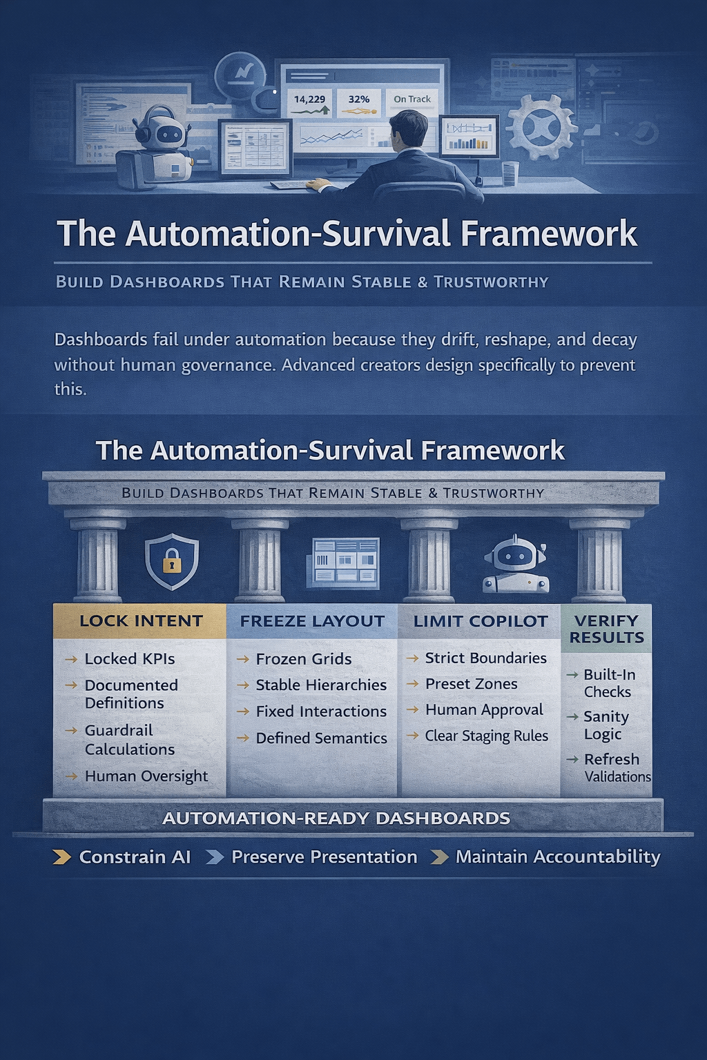
As Excel dashboards become automated and AI-assisted, many quietly lose trust, stability, and meaning. This article explains how advanced dashboard creators design dashboards that survive automation—by locking intent, constraining AI, stabilizing layouts, and preserving human accountability—so decisions remain reliable long after automation takes over.
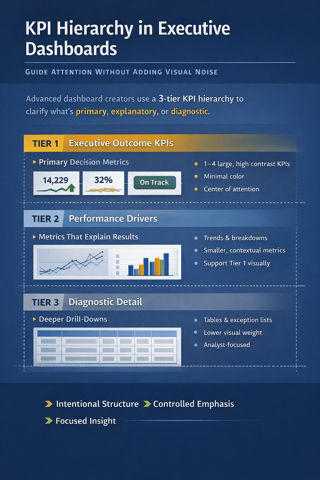
Most Excel dashboards fail not because of missing data, but because everything looks equally important. This article explains how advanced dashboard creators design clear KPI hierarchy—without visual noise—so executives instantly know what matters, what explains it, and where to drill deeper. Learn why Copilot flattens hierarchy by default and how to design dashboards that guide…
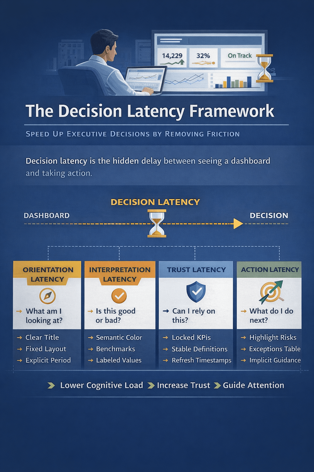
Most dashboards fail not because the data is wrong, but because decisions take too long. This article introduces decision latency—the hidden delay between insight and action—and shows how advanced Excel dashboard creators design for faster executive decisions by reducing cognitive load, building trust, and guiding attention with intent, not noise.
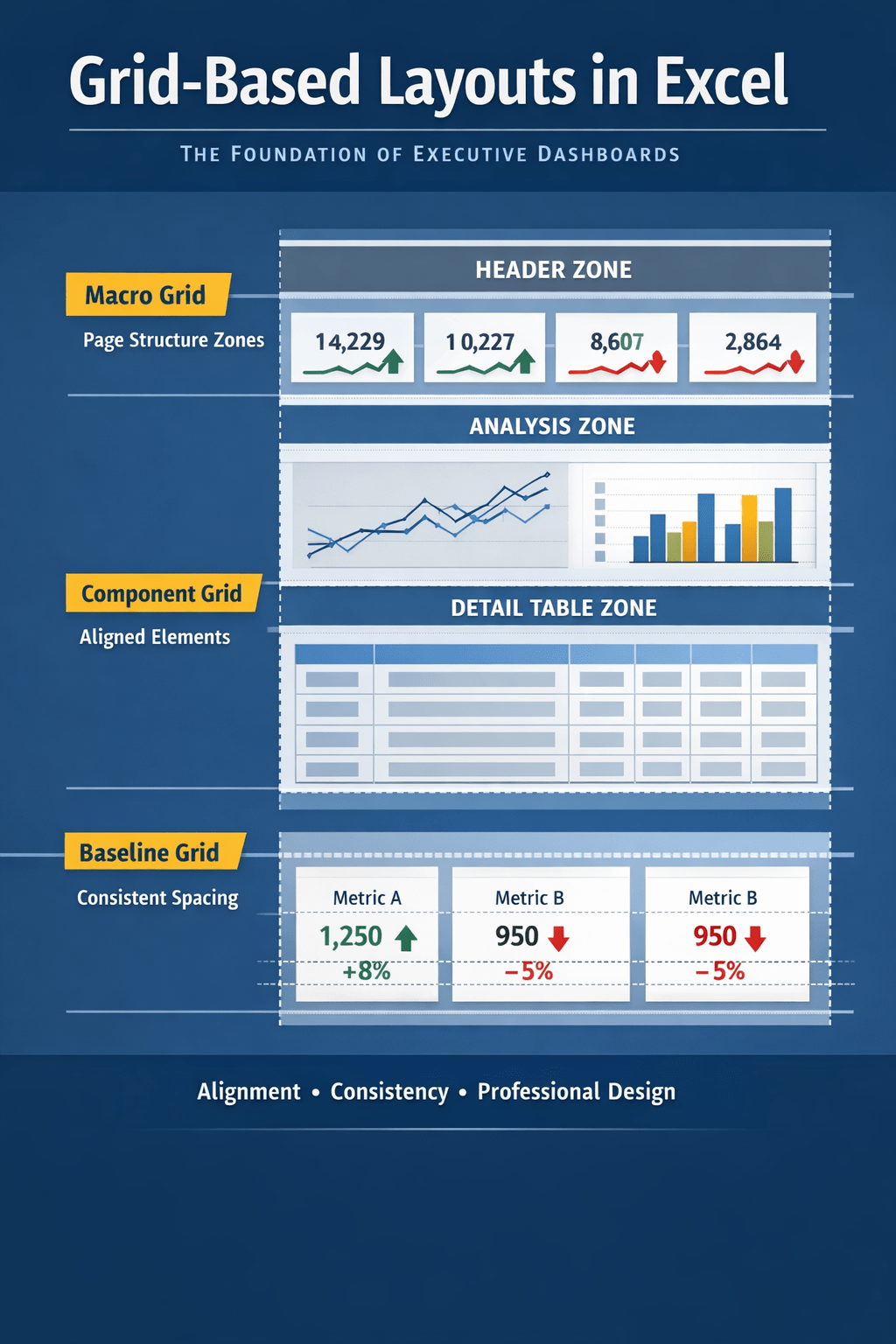
Grid-based layouts are the hidden foundation of executive-grade Excel dashboards. This article shows how experienced creators use structural grids—not visual guesswork—to control alignment, spacing, and hierarchy, and why Copilot-generated dashboards fail without a defined layout system. Learn how to design Excel dashboards that scale, stay consistent, and earn executive trust.