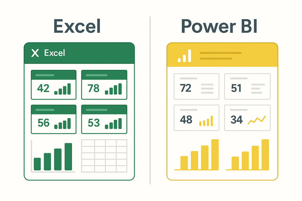
Excel and Power BI are two of the most widely used reporting tools in the world—but their strengths are not the same. As businesses adopt more data-driven workflows, teams often face a critical question: Should we build this dashboard in Excel or Power BI?
The truth is that each tool plays a distinct role in modern analytics. Excel offers unmatched flexibility for fast insights and financial logic, while Power BI excels in scalable, automated, and enterprise-level dashboards. Understanding when to use each tool can dramatically improve reporting quality, reduce operational overhead, and avoid unnecessary complexity.
This article outlines a clear, practical decision framework that teams can use to choose the right environment for dashboards, KPIs, and business reporting.
Part 1 — When Excel Is the Better Choice
Excel continues to dominate tactical and analytical reporting because it is simple, flexible, and universally understood. Excel dashboards are ideal when reporting needs to be quick, adaptable, and tightly tied to calculation logic.
1. Rapid Insight Generation
Excel lets you clean data, modify formulas, and visualize insights in minutes. For ad-hoc dashboards, Excel is still the fastest tool available.
2. Financial and Operational Logic
Budgeting, forecasting, what-if models, and variance calculations often depend on granular formulas that are easier to manage in Excel than in Power BI.
3. Small Teams or Lightweight Reporting
If a dashboard is maintained by a single analyst or a small team, Excel avoids the overhead of publishing, gateways, and refresh pipelines.
4. Direct Manipulation of the Data
Excel gives analysts complete control of the dataset—something Power BI typically abstracts behind a data model.
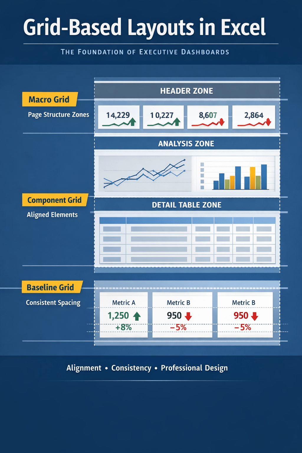
5. Excel Mini Dashboards Fit Perfectly
For compact KPI views, weekly trackers, or project dashboards, Excel’s built-in charts, sparklines, and formatting tools remain unmatched.
Part 2 — When Power BI Is the Better Choice
Power BI becomes the preferred environment when reporting is large, shared broadly, automated, or needs governance.
1. Enterprise-Level Sharing and Distribution
Power BI dashboards can be viewed across the organization with row-level security, access controls, and web-based delivery.
2. Automated Data Refresh
Power BI supports scheduled refreshes—daily, hourly, or near real-time—removing manual work from reporting cycles.
3. Combining Multiple Data Sources
Power BI integrates seamlessly with SQL databases, cloud services, APIs, and enterprise systems.
4. Scalable Performance
Power BI is optimized for large datasets that would slow or break Excel files.
5. Interactive Dashboards
Drill-downs, filters, slicers, and dynamic visuals make Power BI ideal for user-facing dashboards.
Part 3 — Excel and Power BI Together: A Hybrid Strategy
Most organizations do not choose one tool—they use both, each for its own strength.
Excel as the analytical engine
- Calculations
- Scenario analysis
- Finance models
- Variance logic
Power BI as the presentation layer
- Enterprise dashboards
- Automated refresh
- Broad distribution
- Governance and consistency
The combination gives teams agility (Excel) and scalability (Power BI).
Decision Framework: Which Tool Should You Use?
Use Excel if:
- You need a quick dashboard.
- The logic is complex or formula-heavy.
- The audience is small or internal.
- The dataset is small to medium.
- You require frequent manual adjustments.
Use Power BI if:
- You are building an enterprise dashboard.
- The dataset is large or multi-source.
- You need automated data refresh.
- Many users need access.
- Governance or security is required.
This simple framework helps teams pick the right tool with confidence.
Conclusion
Excel and Power BI are not competitors—they are complementary tools serving different layers of the reporting stack. Power BI is the future of enterprise analytics, but Excel remains the foundation of day-to-day analysis and dashboard creation.
For fast insights, financial logic, and flexible reporting, Excel remains unmatched. For large-scale, automated, user-facing dashboards, Power BI is the clear winner.
Understanding when to use each tool ensures that dashboard workflows are efficient, scalable, and strategically aligned.