Dashboards have always been about visibility: turning raw operational data into something a human can scan, interpret, and act on. But in the age of AI, that definition is expanding. The modern dashboard is no longer just a reporting surface—it is increasingly becoming an intelligent interface that explains what changed, predicts what is likely to happen next, and recommends what to do about it.
This shift does not make dashboards obsolete. It changes what dashboards are for.
Instead of asking dashboards to carry the full burden of analysis, organizations are using AI to augment dashboards with automated insights—so that visual reporting becomes the starting point for understanding, not the endpoint.

Why traditional dashboards hit a ceiling
Classic dashboards are designed around three strengths:
- Standardization: everyone sees the same KPIs, definitions, and views.
- Consistency: reporting becomes repeatable—daily, weekly, monthly.
- Visual scanability: charts, tables, and conditional formatting enable quick pattern recognition.
But they also have predictable limitations:
- They’re reactive: most dashboards describe what already happened.
- They require interpretation: the dashboard rarely tells you why something changed.
- They demand time and skill: users must slice, filter, compare periods, and mentally test hypotheses.
- They’re brittle: a new question often requires a new report, new measures, or a redesign.
- They create “analysis backlog”: analysts spend significant time answering recurring questions that could be automated.
As data volume increases and decision cycles accelerate, these constraints become more visible. People still want visuals—but they also want answers.
What “AI-augmented dashboards” really means
An AI-augmented dashboard combines the clarity of visual reporting with automated layers of interpretation. The dashboard still shows the KPIs, trends, and breakdowns—but AI adds intelligence in the form of:
- Narratives: “Revenue fell 6% week-over-week, primarily driven by Region B and Product X.”
- Drivers and attribution: “The largest contributors to the variance were a drop in conversion rate and higher refund volume.”
- Anomaly detection: “This spike is statistically unusual relative to prior Mondays.”
- Forecasting: “If current trend continues, month-end revenue is projected to land 4% below target.”
- Recommendations: “Consider increasing inventory replenishment for SKUs with rising demand and low stock coverage.”
- Natural-language exploration: “What changed most since last week?” answered directly without rebuilding the dashboard.
The AI is not replacing the visuals—it is reducing the cognitive load required to interpret them.
The new role of dashboards: from “display” to “decision cockpit”
In an AI-enabled analytics workflow, the dashboard evolves from a static display into a decision cockpit with three jobs:
1) Confirm the current state quickly
Dashboards still excel at answering:
- Where are we right now?
- Are KPIs above or below target?
- Which segments are outperforming or underperforming?
This remains the “glass cockpit” function: high-level visibility and alerts.
2) Explain what changed and why
This is where traditional dashboards struggle and AI becomes a multiplier.
Instead of forcing users to investigate, the system can surface likely explanations:
- key drivers behind variance
- segments responsible for changes
- leading indicators that moved before lagging KPIs
- correlations worth attention (with appropriate caution)
The practical outcome: fewer “why did this happen?” meetings where everyone spends the first 20 minutes aligning on the facts.
3) Suggest what to do next
The highest-value shift is from reporting to action.
A dashboard becomes materially more useful when it supports:
- prioritized next steps
- “if you do X, Y is likely to improve” scenarios
- operational workflows (create a ticket, notify a team, trigger a playbook)
This is the moment dashboards stop being “views” and become “interfaces.”
What changes in dashboard design when AI enters the picture
Adding AI to dashboards is not just a feature upgrade—it changes design priorities.
Move from “dense pages” to “guided attention”
Traditional dashboards often try to cover everything on one screen. AI enables a cleaner alternative:
- show only essential KPIs and trends up front
- let AI highlight what deserves attention
- provide drill-downs only when needed
This reduces clutter while improving decision speed.
Design for “why” and “what next” panels
Many AI-augmented dashboards add structured insight components, such as:
- Top drivers (variance decomposition, factor attribution)
- Key contributors (ranked segments causing change)
- Anomalies (outliers with explanations)
- Predictions (forecast + confidence band)
- Recommended actions (playbook triggers, operational suggestions)
These panels should be treated as first-class citizens, not afterthoughts.
Treat natural-language as a navigation layer
Instead of relying exclusively on filters and slicers, users can ask:
- “What’s the main reason churn increased?”
- “Which products are most responsible for margin decline?”
- “Show me outliers in refunds by region.”
In a dashboard context, natural language is less about “chat” and more about query acceleration.
Add transparency and trust cues
AI-driven insights must be explainable enough to be trusted. Strong dashboards make AI confidence visible through:
- cited data slices (“this is based on last 30 days”)
- confidence indicators (“high confidence”, “medium confidence”)
- easy “show your work” drill-throughs
- clear separation between facts, inferences, and recommendations
Without this, users either ignore the AI—or overtrust it.
The operational benefits: what organizations actually gain
When AI is applied well, teams see improvements in:
- Faster time-to-insight: fewer manual investigations.
- Less repetitive analyst workload: automated answers to recurring business questions.
- Better anomaly response: earlier detection and quicker resolution.
- More consistent interpretation: reduced dependence on “the one person who knows the dashboard.”
- Improved decision quality: forecasting and scenario support reduces guesswork.
- Higher dashboard adoption: dashboards feel more helpful because they explain, not just display.
The dashboard becomes less of a report and more of a daily decision habit.
The risks: where AI-augmented dashboards can go wrong
AI can improve analytics, but it can also amplify common failures if implemented poorly:
Hallucinated or misleading explanations
If the insight layer generates confident narratives without rigorous grounding, it can mislead. This is especially risky when:
- data is sparse or noisy
- definitions differ across teams
- the AI is not tightly constrained to validated datasets
Spurious correlations presented as “drivers”
Correlation is not causation. AI can surface patterns that are statistically real but operationally meaningless. Good systems:
- qualify explanations as hypotheses
- provide evidence and context
- avoid over-asserting “root cause” without validation
Over-automation that removes human judgment
Dashboards exist because human oversight matters. AI should reduce low-value manual work, not remove accountability. The best implementations keep humans in the loop for:
- high-stakes decisions
- exceptions and edge cases
- policy-sensitive actions (pricing, HR, compliance)
Privacy and governance issues
AI insight features often require broad data access. That increases the importance of:
- role-based permissions
- masking sensitive fields
- audit trails for queries
- governance around KPI definitions and data lineage
In other words: the more “intelligent” the dashboard becomes, the more governance becomes non-negotiable.
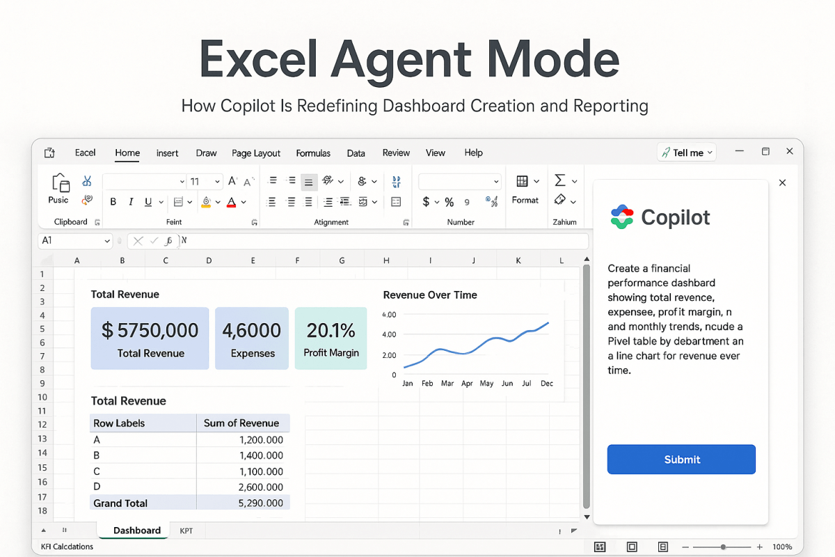
What this means for Excel dashboards and lightweight reporting stacks
Not every team has an enterprise BI platform. Many businesses—especially midsized companies—still run on Excel dashboards for good reasons: speed, flexibility, and low overhead.
AI can enhance this world too, in practical ways:
- Automated commentary: generate a weekly narrative summary from KPI tables.
- Variance explanations: highlight top contributors to delta vs last period.
- Forecast support: apply simple forecasting models and explain the projection.
- Quality checks: flag missing data, outliers, or inconsistent inputs.
- Natural-language to formula: accelerate model building by generating formulas and transformations.
In Excel-driven environments, the goal is not to create “AI everywhere.” It is to add just enough automated insight to reduce manual interpretation and improve decision speed.
A practical blueprint: how to evolve a dashboard into an AI-augmented system
A sensible path looks like this:
- Stabilize the metrics layer
- consistent definitions
- clean data sources
- reliable refresh cadence
- Add insight layers gradually
- start with anomaly detection and variance explanations
- then add narratives and forecasting
- finally add recommendations and workflow triggers
- Make trust visible
- show source periods, filters, and confidence
- provide drill-through to evidence
- Tie insights to action
- link insights to playbooks, owners, or operational steps
- ensure the dashboard leads somewhere, not just to more charts
The bottom line
Dashboards are not ending in the age of AI. They are being redefined.
Visual reporting remains the fastest way for humans to orient themselves. But AI changes what happens next: it compresses the time between seeing a result and understanding what it means. The most effective dashboards will be those that combine:
- clean visuals for situational awareness
- automated insights for explanation
- predictive signals for anticipation
- recommended actions for execution
In short, the dashboard becomes less like a mirror and more like a co-pilot.